ASPRIS
Rebrand | Ethos | ACD | Mr.President
ELEVATING THE ASPRIS BRAND
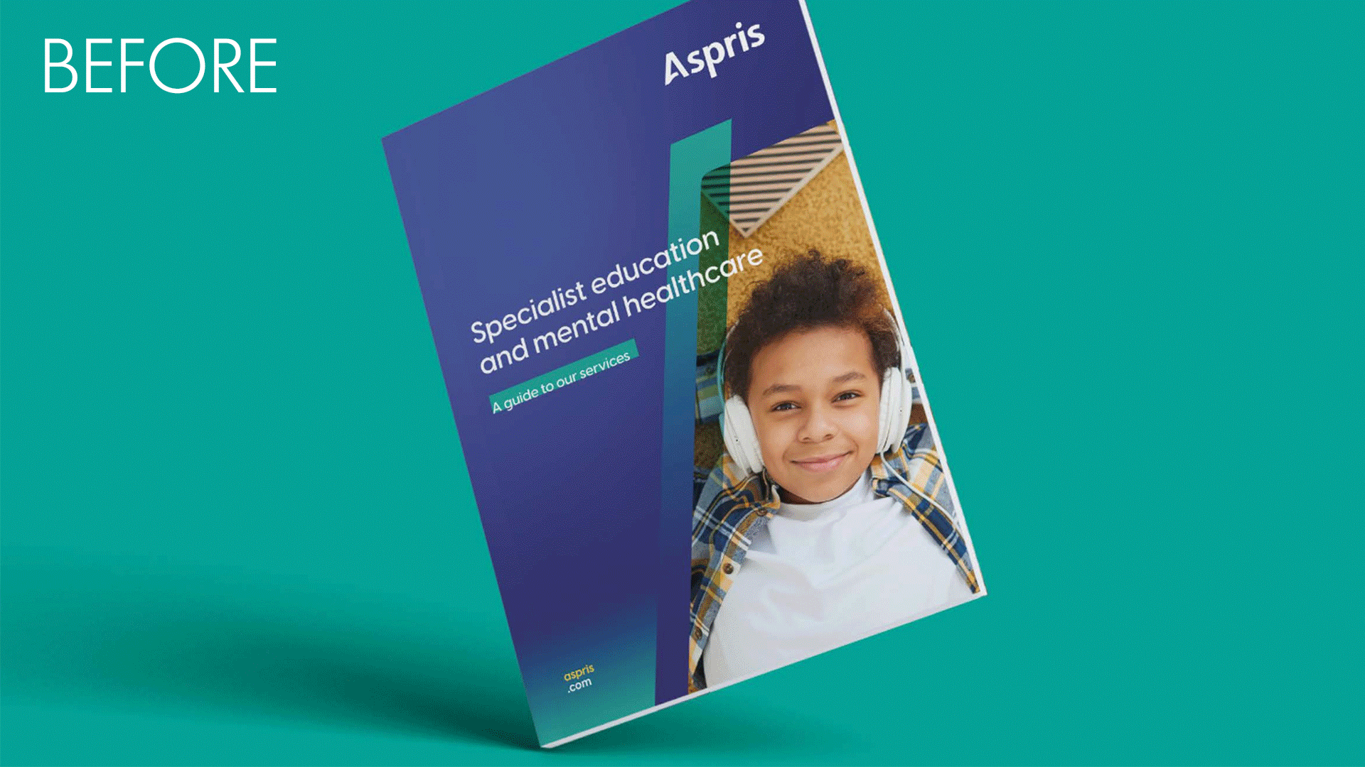
Aspris provides children’s services across specialist schools and care homes for young people in the UK. Their existing branding felt corporate and sterile, which was at odds with them as a business. The challenge was to bring the warmth and heart of the service they provide into their brand story whilst still retaining professionalism. Making it child friendly, but not childish.
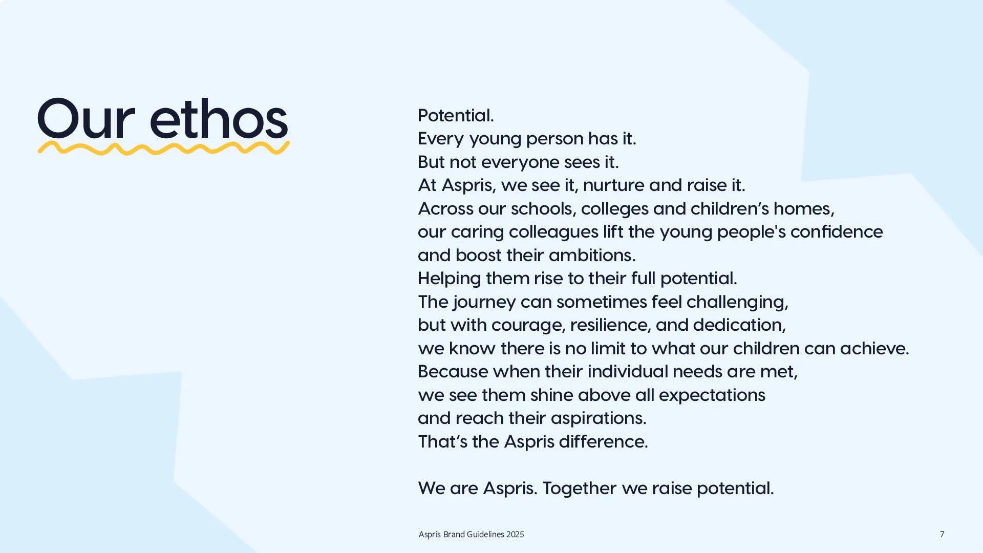
We started by speaking to all the teams across the business to get a real feel for who they were and what they wanted to achieve. It became clear very quickly that everyone was striving to help young people to unlock possibilities and reach their aspirations. This led us to their new BDI and ethos ‘Together we raise potential’, reflecting a shared commitment to uplifting young people to be the best they can be.
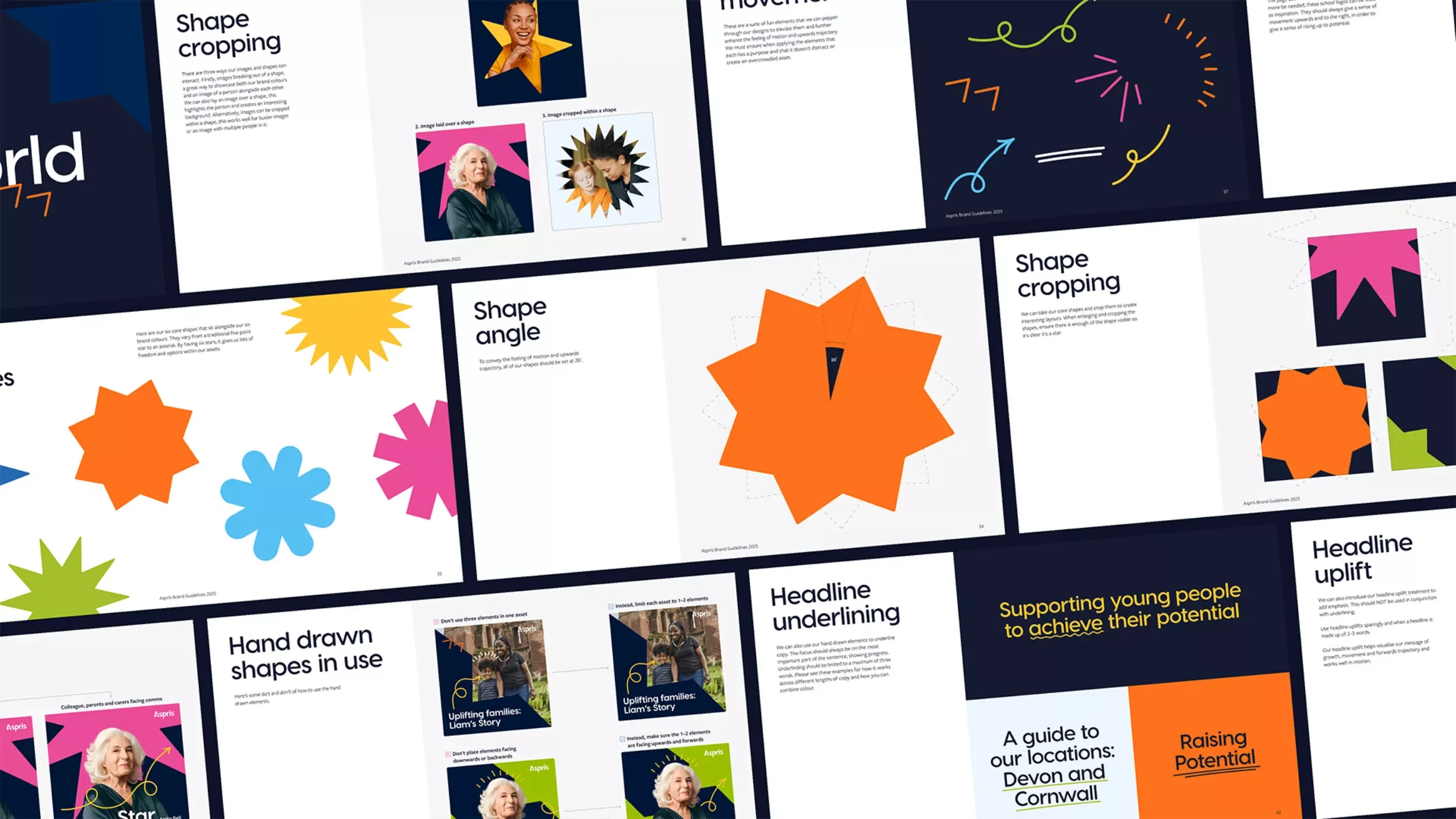
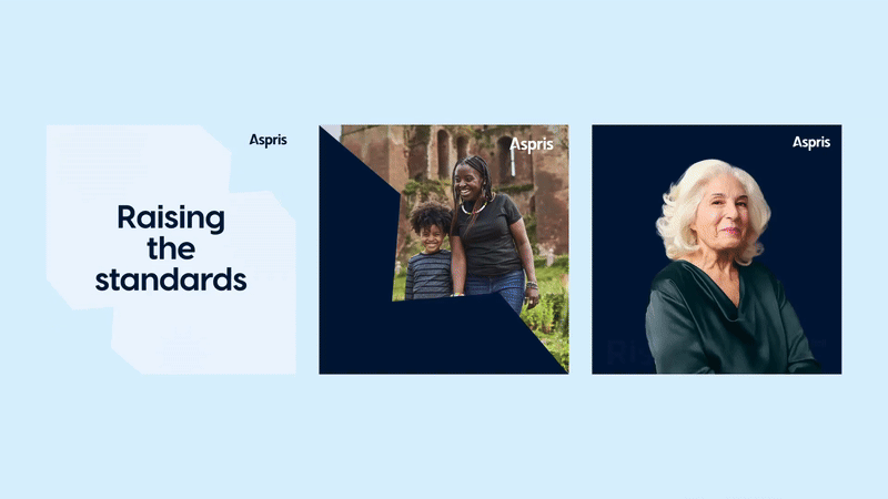
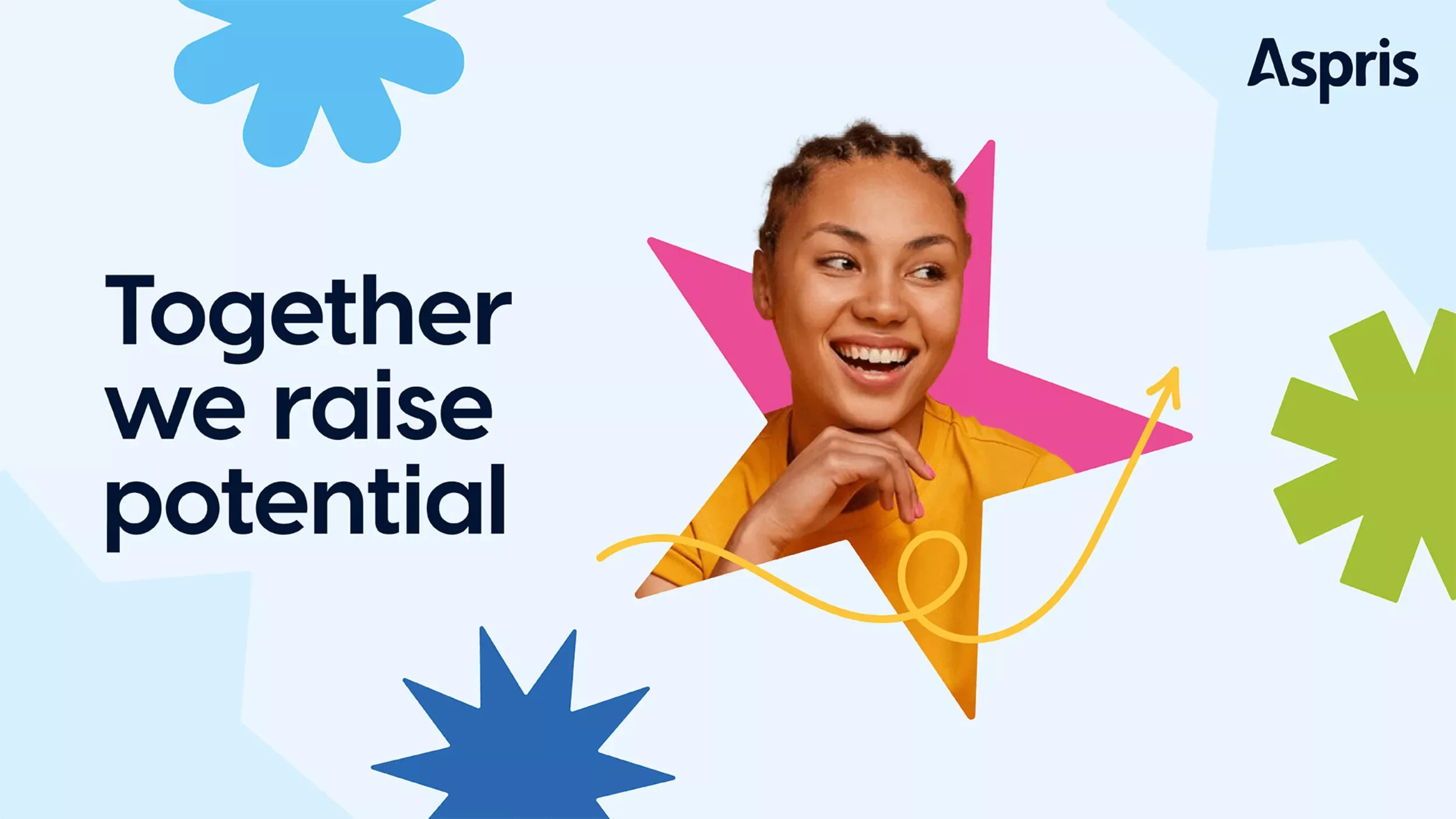
From there we created a new visual identity that could flex across their various different audiences from local authorities to the young people and their parents. Aspris means ‘from hardship to the stars’ in Latin, aligning with the new brand line ‘Together we raise potential.’ This inspired a design system of varied star shapes, representing the unique potential Aspris helps to elevate.
We created a more uplifting colour palette that complimented their existing blues, a set of hand drawn elements that are inspired by the existing school logos, and evolved their typographical treatment to rise up. All of the elements were created so that the playfulness of the comms could be dialled up and down depending on the audience.
We then handed the new guidelines over to their internal team for them to implement across their website and own channels.